Sofia Terzidou and George A. Pappas make up the in-house UI/UX design team and when they’re not sketching concepts, wireframing prototypes, interviewing users, researching the latest design tools and methodology, or slicing up tasty, new image assets they’re helping bring our product suite one more step forward tweaking, tugging, and experimenting as they go.
George
Painting houses
You know as much as we’ve moved very assuredly into the digital age, I have a deep appreciation for handiwork. I fondly remember painting houses as a way to earn some spending money during the college years.
What impressed me most about this simple, timeless work was the sense of growing satisfaction as the room and then the house grew brighter, became cleaner, and underwent this immersive transformation right before my eyes.
Sofia
Transformation, you said?
“Why? has been plaguing humanity (at least the healthy part of it) for thousands of years. So, *why* would you want to transform something? Let me put it on just two bullet points:
a. Always aim for a better version of what you’ve already launched
New features, new design trends (I hate that word but you know what I mean) and competition are the main forces that make a design team come up with ideas that push the product forward. So, you roll up your sleeves as George likes to say, and apart from actually designing, you need to be able to remind the whole team *why* and *what* we should be aiming for.
b. Always listen to the User
Designers are not artists. I will never stop saying that. Artists can do whatever they want, no apologies, no explanations. Designers, on the other hand, work for the User. If a user can’t or won’t use your product, then that’s something that should probably worry you a bit, no? So, you gather user feedback, get your tools ready and dive in.
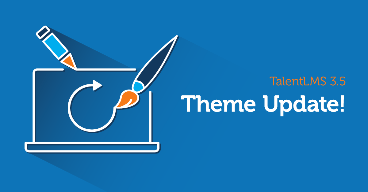
That’s what we did for the TalentLMS new theme. We needed to keep up with new user experience principles, offer our users a fresher look and stand out from the competition.
George
Rolling up our sleeves
So we’ve gone ahead and done just that with the latest TalentLMS release – moved out all the furniture, covered all the floors carefully, ever so carefully, to make sure not one drop of bright, bold, new paint would go to waste, and went to work.
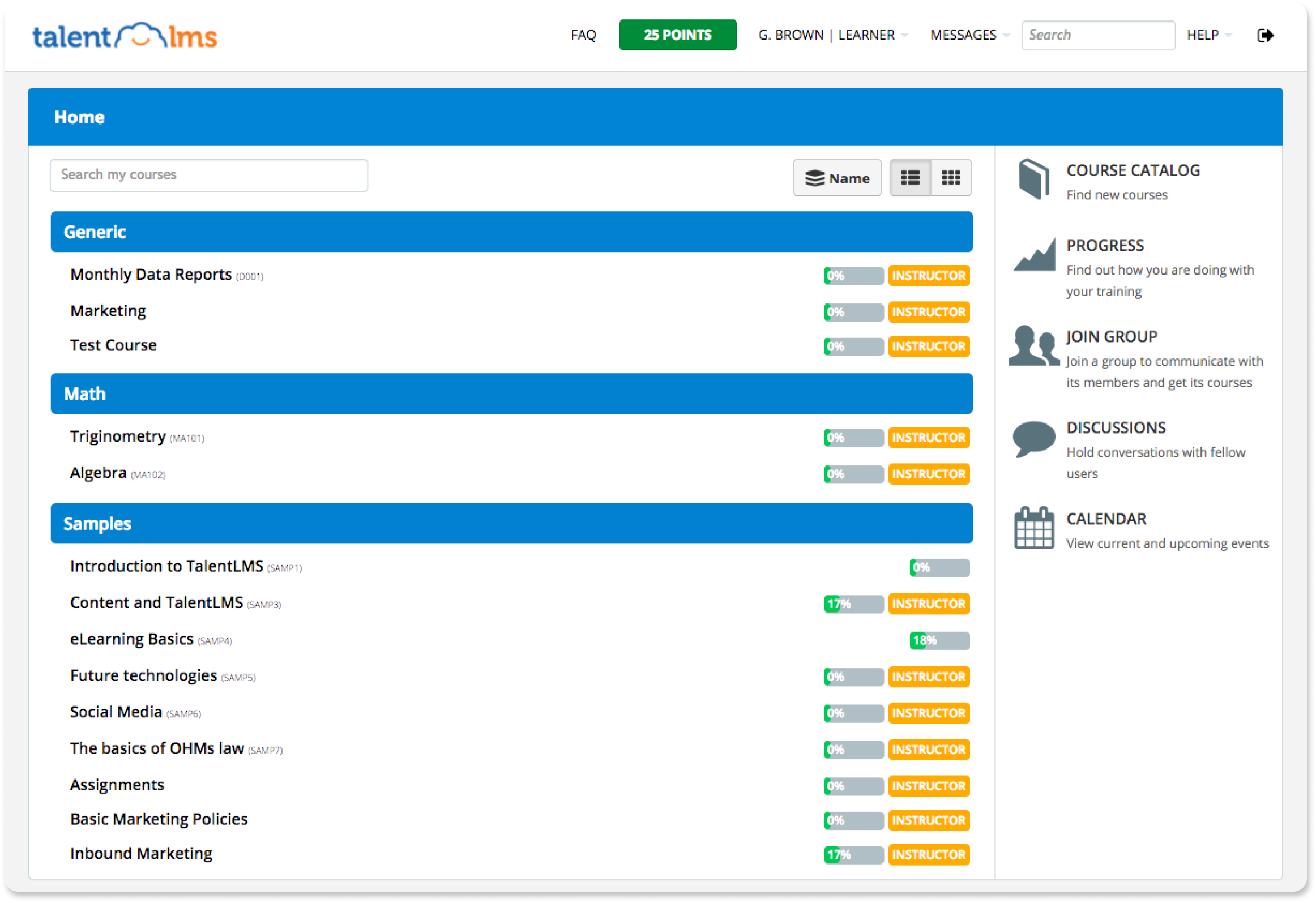
For those of you who have joined us most recently, you will now be looking at the Modern theme when creating your first eLearning portal. We’ve been as careful as we can to not intrude with your own portal customization for our existing users, but if you’re feeling curious we’d love to hear what you think about our recent re-touchings.
Getting out the brushes
Gripping our brushes with surgical precision, we’ve made small changes to the default TalentLMS theme in just the right places and just the right amounts to reach an end-result which we hope you too shall find to be brighter, cleaner, and distinctly more modern than before.
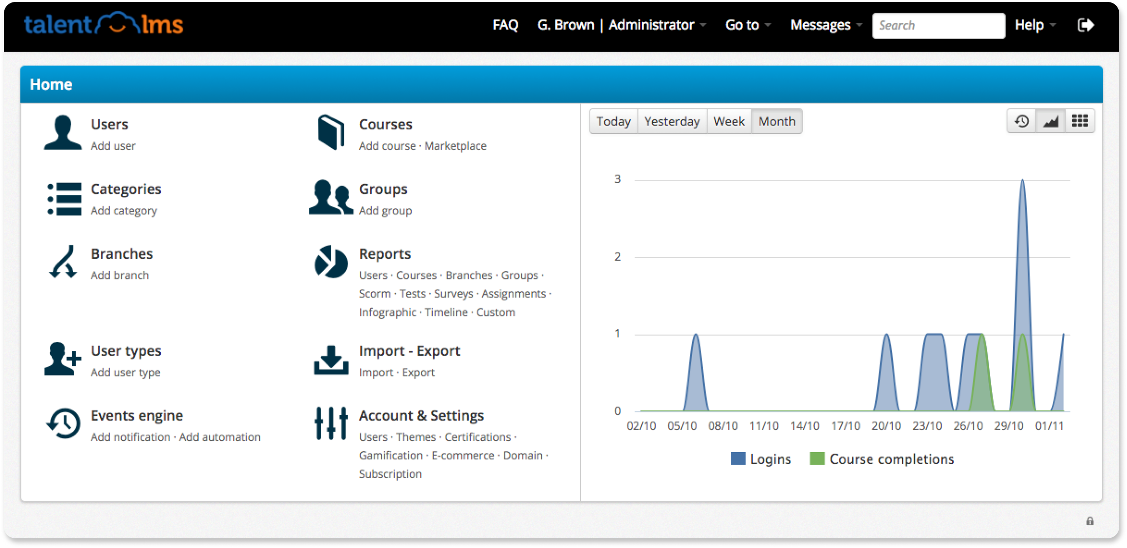
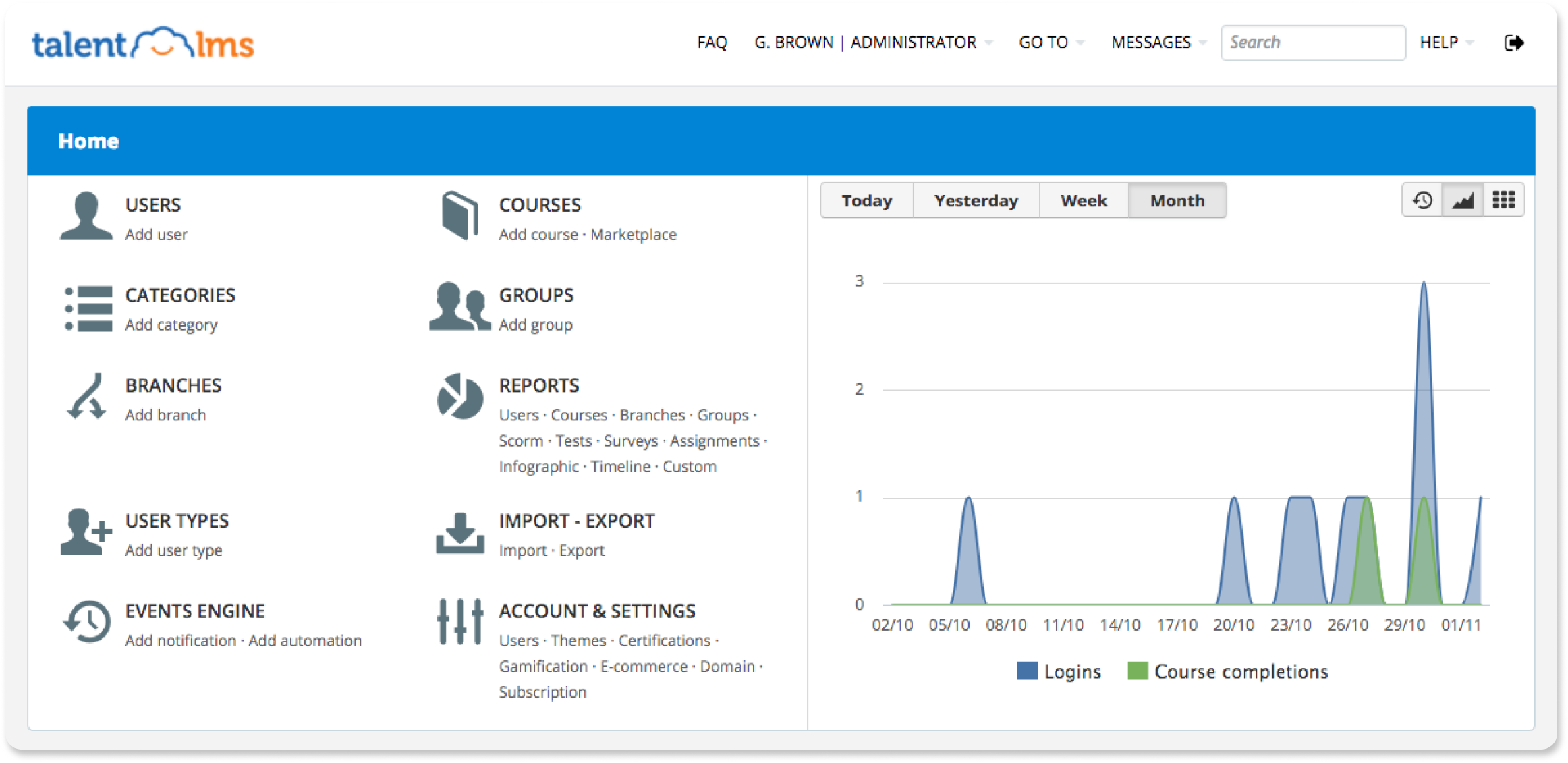
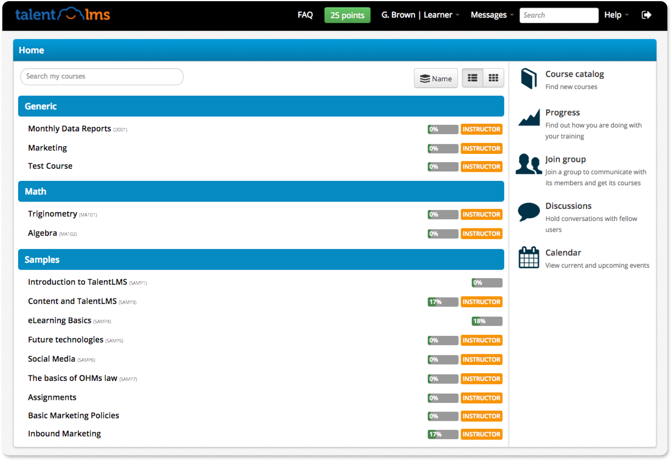
We’ve reworked our grids and made sure to pinch and nudge, nip and tuck, and not be afraid to go bright and bold with our buttons and labels. We’ve better aligned our columns and rows and given items more space to breathe and grow, making sure you can still find all your favorite tools exactly where you remember them being.
Sofia
Good point!
Although subtle changes are not my cup of tea, when a complex product has been in the hands of so many people for such a long time, you need to be careful.
We aimed for a fresher look here, not for a user interface overhaul so it was very important to be as discreet as possible. Cunning would also be a fitting word to describe the situation. A better usage of whitespace and a fine-tuning in colors and grids can work wonders. Check it out for yourself!
Both
An eye to the future
So there you go: small changes across the board using a little bit of design logic and good old-fashioned hard-work and spit-polish to come up with our most modern theme to date.
We’d love to know how you feel about the new theme, so why not tweet the TalentLMS Design Team and let us know your thoughts?
The Design Team will be back soon with more UI/UX updates to help make your experience using our products even more improved. (Rumours say next time we’re coming back covered in grease and dirt as we go deep under the hood…)
Until next time then!