Learner engagement is key to a healthy course completion rate. Different factors influence this. Course relevance, content and design, interactivity, motivation, and accessibility all play a part. Before you can draw on any of these, you need to set the tone for the right mindset. Here’s where your training portal homepage comes in.
The gateway to all of your learning resources, your training portal plays a big part in your employees’ ongoing relationship with their development program. But it’s the homepage where that relationship first begins. It’s where learners form their initial impressions of what’s to follow. And, by influencing and determining mindset, it has the power to either drive or dampen engagement.
Even so, it’s often overlooked. Despite its potential, many training portal homepages are, at best, purely functional and, at worst outdated and off-putting. Why? Well, designing a homepage sounds time-consuming. It also sounds technically challenging. And, whether it’s due to a perceived lack of confidence, skills, or time, it’s often a task that busy training managers and designers leave off their list.
The truth is, though, an effective homepage training portal doesn’t need to be complicated. Neither does it have to reinvent the wheel. (In fact, the clearer and simpler, the better.) And, with the right tools and some good examples to follow, it’s quick and easy to create.
Ever wondered what a cleverly-crafted training portal homepage looks like? Read on for best-practice tips to guide your strategy. Plus, real-life examples to feed your imagination.

Mindset does matter: How to optimize the power of positive thinking
To access your training portal, your learners go through your homepage. So, in its simplest form, all it needs when you build your training portal homepage is to provide a login or signup form. It’s a practical approach. But it’s also a missed opportunity. As a training manager or designer, you want to convert as many homepage visitors as possible into active and engaged users of the courses you’ve spent time developing.
Your homepage has great potential to do that. But what kind of content should you add to achieve your goal of optimizing learner engagement? To answer that question, you need to ask another question first: What do your learners want, and how can you give it to them? Time to put yourself in your users’ shoes.
Help me feel at home
In the world of web design, the psychology of familiarity is used to drive higher conversion rates. Why? Because familiarity has a big impact on decision-making. We unconsciously favor things we’re used to. We take comfort in them. It’s also easier for us to process them. So, how can you apply this principle to your training portal homepage? In short, you customize your training portal homepage so it’s consistent with the rest of your brand. This evokes feelings of “familiarity” and reassures users instantly that they’re in the “right” place. But there are lots of Let’s break it down further.
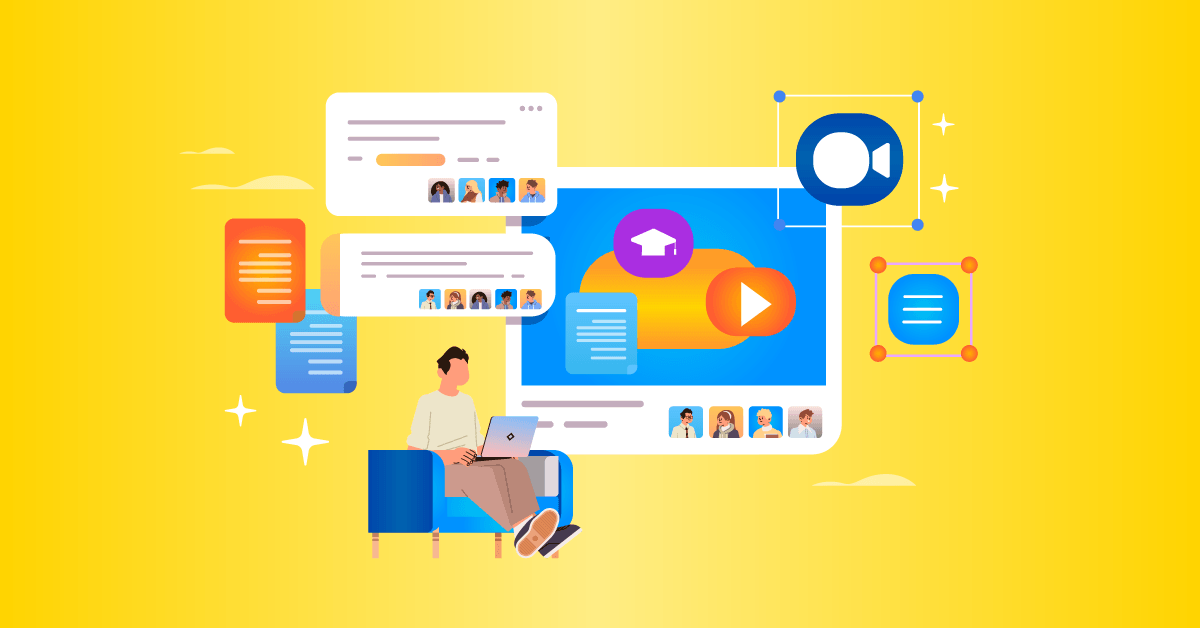
Engage learners in training with a beautiful portal
Customize your training homepage in just a few simple clicks with TalentLMS.
The training platform that users consistently rank #1.
It looks “right”
Visitors to your homepage will perceive and process visual elements first. And even the smallest and simplest tweaks to the design will make a big difference to how comfortable they feel. Here are some techniques to try:
- Showcase elements from your branding to make the page feel welcoming and recognizable. Include your company logo, use your preferred font for textual elements, and change the color of CTA buttons, headlines, and subtitles to reflect your branding color palette.
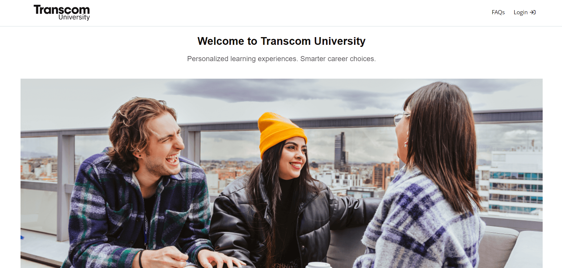
- Web users perceive pictures faster than words. Add a hero image or banner at the top of your homepage that captures your brand and the essence of what your company training stands for. To support its “learning beyond the classroom” tagline, for example, Transcom University uses a photograph that communicates a feeling of freedom and fun.

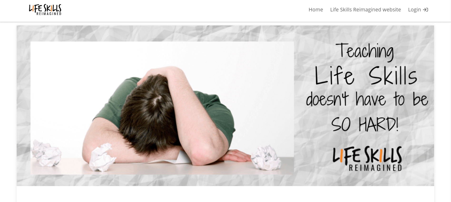
Life Skills Reimagined’s approach is also emotive but depicts a common pain point designed to resonate with users.
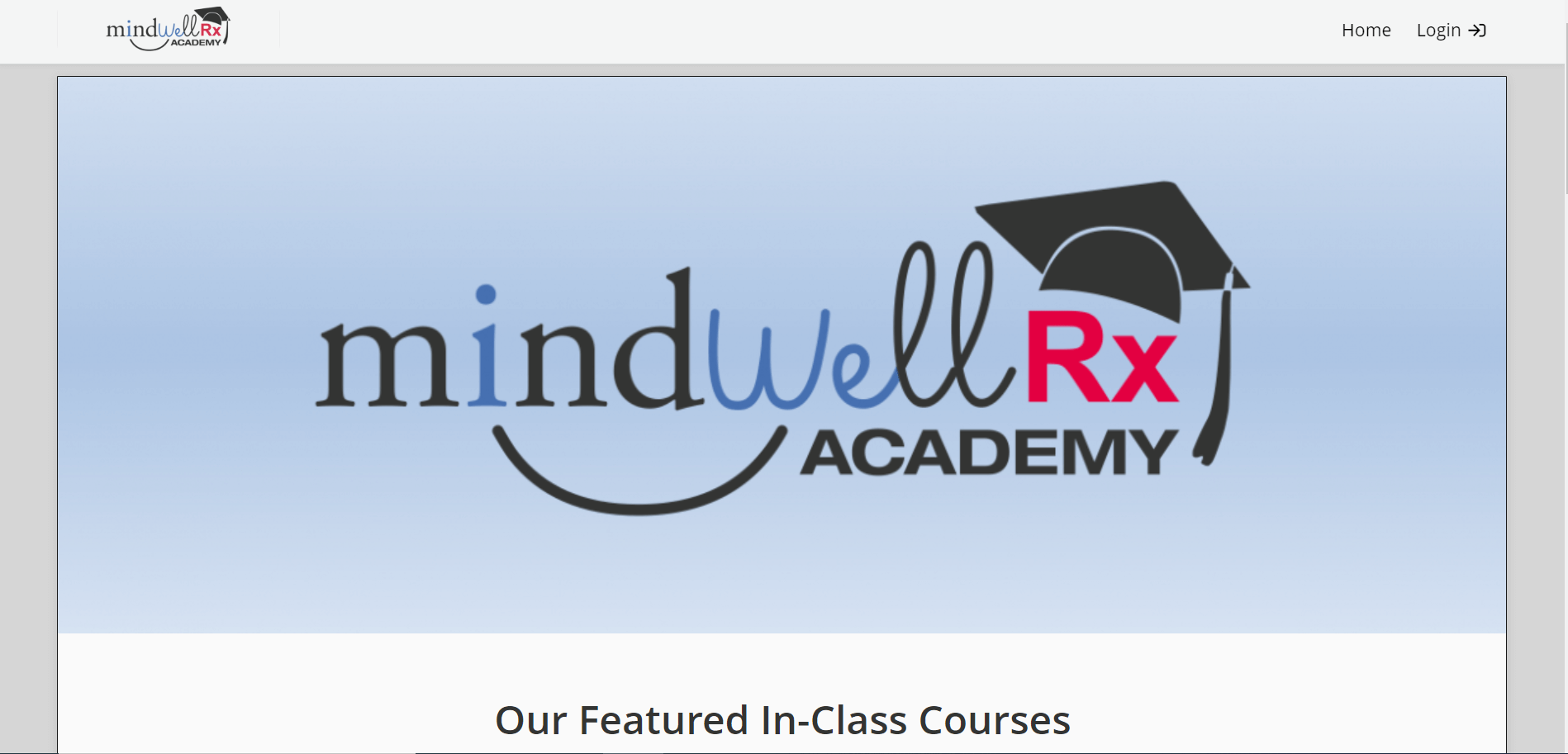
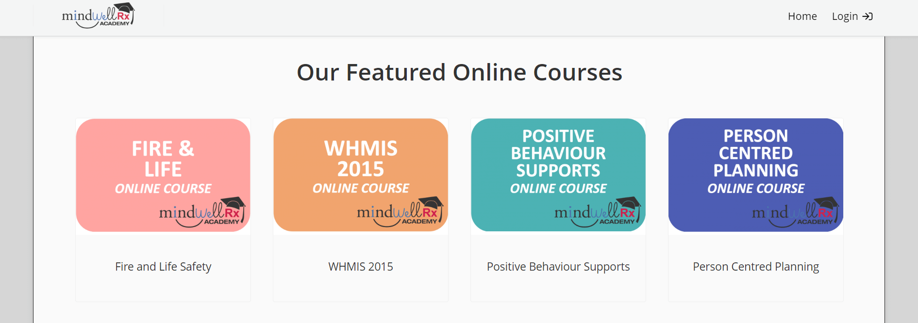
If, instead of photos, you use a distinct form of graphics (custom illustrations or mascots, for example) as part of your brand, design your banner around this. Still trying to decide what to use? When in doubt, go for a big and bold version of your logo, like Mindwell Rx Academy.
It sounds “right”
Having first experienced your visuals, visitors will swiftly move onto the words you use on your homepage to validate their first impressions. Again, the consistency of the brand takes center stage here. To make sure the message they hear keeps them in their comfort zone, apply the following principles:
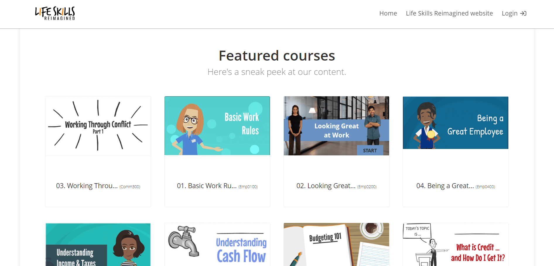
- Ask yourself: Is the voice you’re using one your learners will recognize? Visitors to your homepage are more likely to trust what you say if it’s delivered in a consistent tone with all of your other communications. By encouraging visitors to take a “sneak peek” of their training content, for example, Life Skills Reimagined quickly echoes the friendly, informal tone of voice typical of their brand.
- Reinforce keywords and phrases that your users will associate with your messaging and values. “Personalization” and “smart” are both integral to Transcom University’s value proposition. It makes sense to reference both high up on their training portal homepage.
- Have you got a company tagline or slogan? Incorporating this into the page speaks to your brand. And reminds visitors that they’re in a safe and familiar place.
It feels “right”
With words and pictures reinforcing your brand identity, you can create a deeper connection with your users by highlighting additional content on your portal homepage. Remember to keep relevance levels high. And sync this content up with the general tone of the page and your brand identity. Unsure what to include? Take your pick from the following:
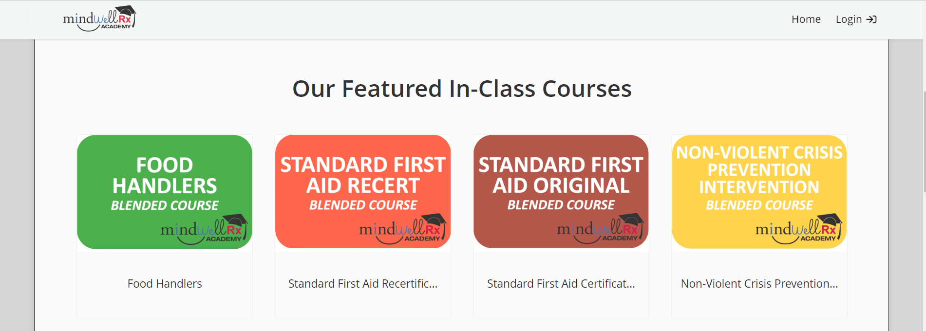
- Showcase some of your courses. Pick your most popular courses or cover a broad range to ensure there’s something that will resonate with a wide variety of users. Life Skills Reimagined do this well by blending soft skills training like conflict management with more practical learning topics such as budgeting and cash flow. Mindwell Rx Academy appeals to different learning types by featuring both in-class and online courses on their homepage.
- List a few key points or promote some of the benefits of your training. You’ll grow engagement by explaining clearly and simply why your training matters and what it can bring to your learners. And encourage users to log in and start learning. Using icons as well as text will make it quicker and easier for visitors to differentiate between each point.
- Add an extra level of validation to your training by sharing testimonial videos or a few short quotes from learners with a CTA to ‘Learn more.’
- Offer a deeper layer of personalization by creating unique homepages with bespoke content for independent training environments. Often referred to as branches, these homepages might target groups such as vendors, clients, or different departments.
Spark my interest
Creating a safe and familiar environment that breeds trust is an important part of what makes your homepage a success. But it’s not enough on its own. You also need to generate interest. And, if possible, some excitement. That’s where your homepage headline comes in. It’s probably one of the first things you’ll add when you customize your training portal homepage.
Want to create a familiar training environment?
Adjust your training portal to match your brand with TalentLMS.
The training platform that users consistently rank #1.
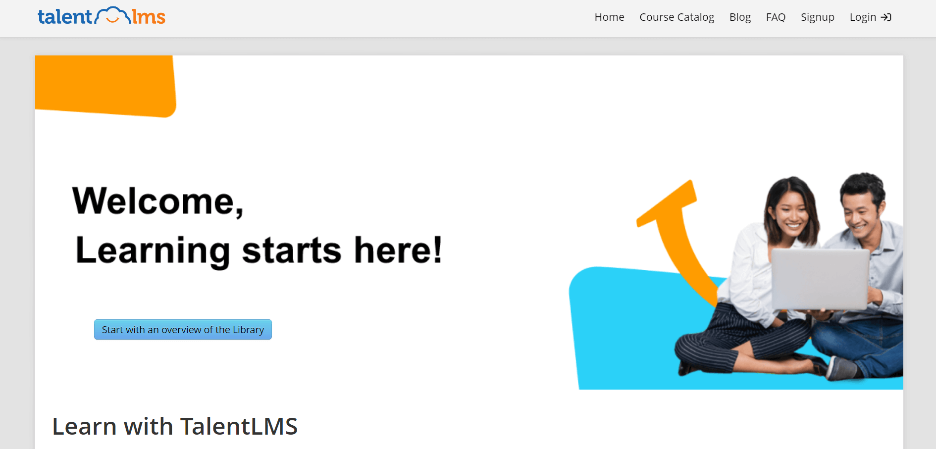
And it may only be a few words, but it’s one of the most important pieces of copy on the page. Keep it clear, short, and simple. But also active and energetic. For example, ‘Welcome! Learning starts here!’ With interest peaked, maintain momentum by sharing stats and short videos that bring training to life. Or provide a link to your blog using a homepage menu.
Reassure me
Your training portal homepage can only hold so much information without becoming cluttered and confusing. And it’s important to limit the content so it remains clear and relevant to all your users. That said, you don’t want visitors to your site to feel uncertain or unsure about something. But how do you offer more content without detracting from the main focus of the page? Simple. You use a menu.
The menu at the top of your homepage is where your users go to log in or sign up to your portal. But it doesn’t have to be limited to that. It can also be expanded to navigate users to support and extra information. Enhancing it in this way is also another way you can reach out and connect with your target audience. Common examples of content you can link to from a menu include FAQs, support information, a company or training blog, your company website, or your course catalog.
Show me the way
The ultimate goal of your training portal homepage is to compel visitors to dig deeper into your site and engage with your learning program. They can, of course, do this through the main menu we’ve just mentioned. But this isn’t the only way to create movement and traffic to your portal.
Calls-to-action (CTAs) are equally as effective. Particularly if you adhere to these tips:
- Make sure there’s at least one or two above the fold (for example, next to your banner)
- Adjust the placement on the page so they’re easy to identify in relation to other content on the page
- Help them stand out by using a color that contrasts with the rest of your homepage, but that’s still in keeping with your general branding color palette
- Keep the copy brief and action-oriented. For example, ‘Learn more,’ ‘Start with an overview of the Library,’ or ‘View course catalog.’
Putting it in all perspective
To drive learner engagement through your training portal homepage, you need to consider the mindset of your users. Of course, that’s not all you need to consider. Having the right tech and tools to bring your training portal homepage strategy to life is also vital (cue a white-label LMS with custom homepage functionality).
But it all begins by thinking like your learner. Start by seeing things from their perspective before you build your training portal homepage. And the rest (positive mindset and learner engagement included) will follow.
| Tags: Learner Experience,Online Training