
Infographics have been all the rage since they emerged on the web and enterprise scenes a few years ago.
And why not? They offer something that complicated dashboards, detailed reporting systems, and overloaded Excel files, don’t: the ability to immediately see the big picture about a subject, in an intuitive and, well, fun, way.
Infographics can be used internally inside a company, to give macro-level insight about some area of its operations (e.g. its eLearning program), and, depending on their subject, they can also be presented to the general public (e.g. the company’s target audience) and still be clear and understandable.
The only issue with infographics was that originally they had to be manually crafted, by a designer sweating over a macro-level data set provided and broken down by a statistics person. So they were hard to produce and somewhat costly.
Fortunately, for TalentLMS users at least, this is no longer the case. TalentLMS has two built-in templates that you can leverage at any time to get your own, up-to-date, training infographic. Let’s see what they cover, and where you can find them.
Training Portal Infographic
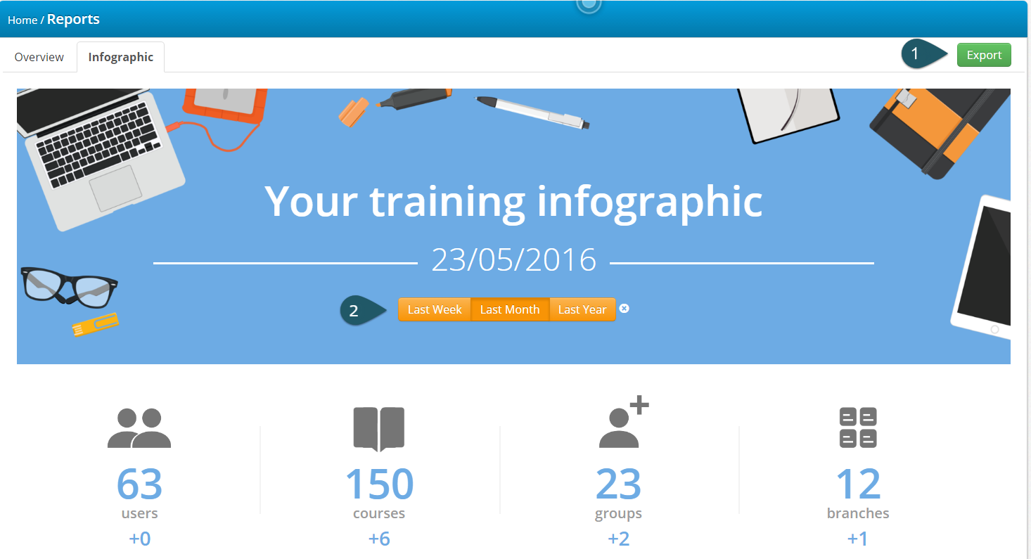
This is a “big picture” infographic that shows statistics and operational information about your training program as a whole.
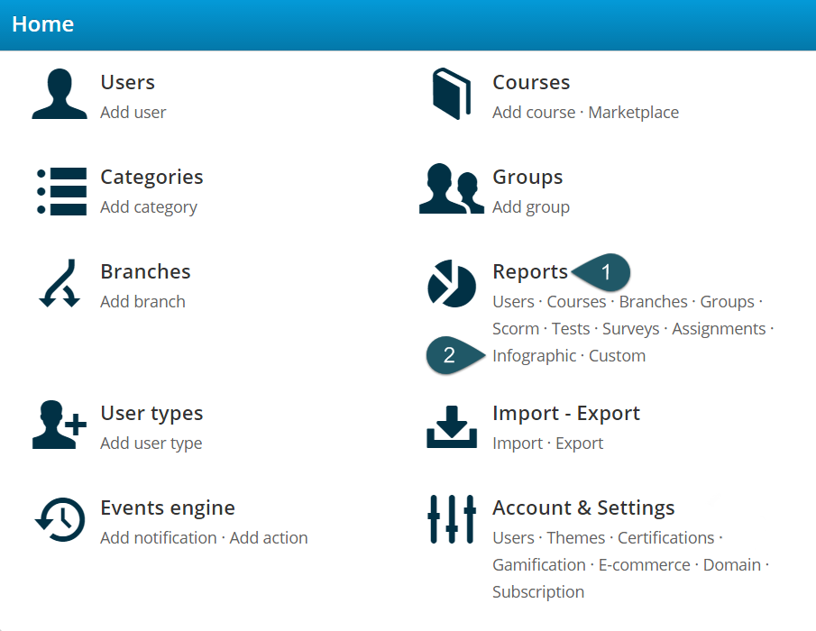
To view it, log in as an Administrator and click on the Infographic option of the Reports section.
The infographic will be generated and displayed with the latest data available in TalentLMS, showing statistics on your portal usage, the most active courses, measured in training time spent in them, course completion and test pass rates, a breakdown of gamification achievements, and a tally of the various kinds of content in your training library.
The eLearning infographic also uses some heuristics to calculate potential cost savings, such as “Less commute hours”, “Training savings” and “Better skilled people”.
The formula for the calculation of commute hours savings is:
0.5 * 0.5 * 1.3 * eLearning hours
and is based on the assumption that an average commute takes 30 minutes (first 0.5), only half of the trainees require a commute (second 0.5), and eLearning hours are condensed compared to traditional training (so 1.3 hours of classroom-based training translate to 1 hour of eLearning).
Based on this, the hours saved commuting are calculated as 0.5*0.5*1.3 of your eLearning hours. This is an average estimation: depending on your company’s location and infrastructure it might be on the low or on the high side.
Similarly, the formula for the calculation of the training savings is:
80*1.3 eLearning hours/20 + 10*1.3 eLearning hours
In other (or, rather, more) words, we regard the cost for creating courses as a fixed constant (which we don’t take that into account here), and consider that a trainer is needed for every 20 people, and costs $80 per training hour.
Similarly, we estimate that each learner is compensated with a small amount of money ($10 in our equation ) for each training hour they complete. And, as previously, we calculate 1 eLearning hour as 1.3 traditional training hours to arrive at the total savings.
As for “better-skilled people”, the heuristic here is quite easier: it’s just the number of unique learners that have completed at least one course.
On the top of the screen you’ll find the “Export” button, which allows you to export your training infographic as a PNG file for sharing, while the “Compare” button on the top of the infographic allows you to compare the current status of your portal with the last week, month, or year.
The User Infographic
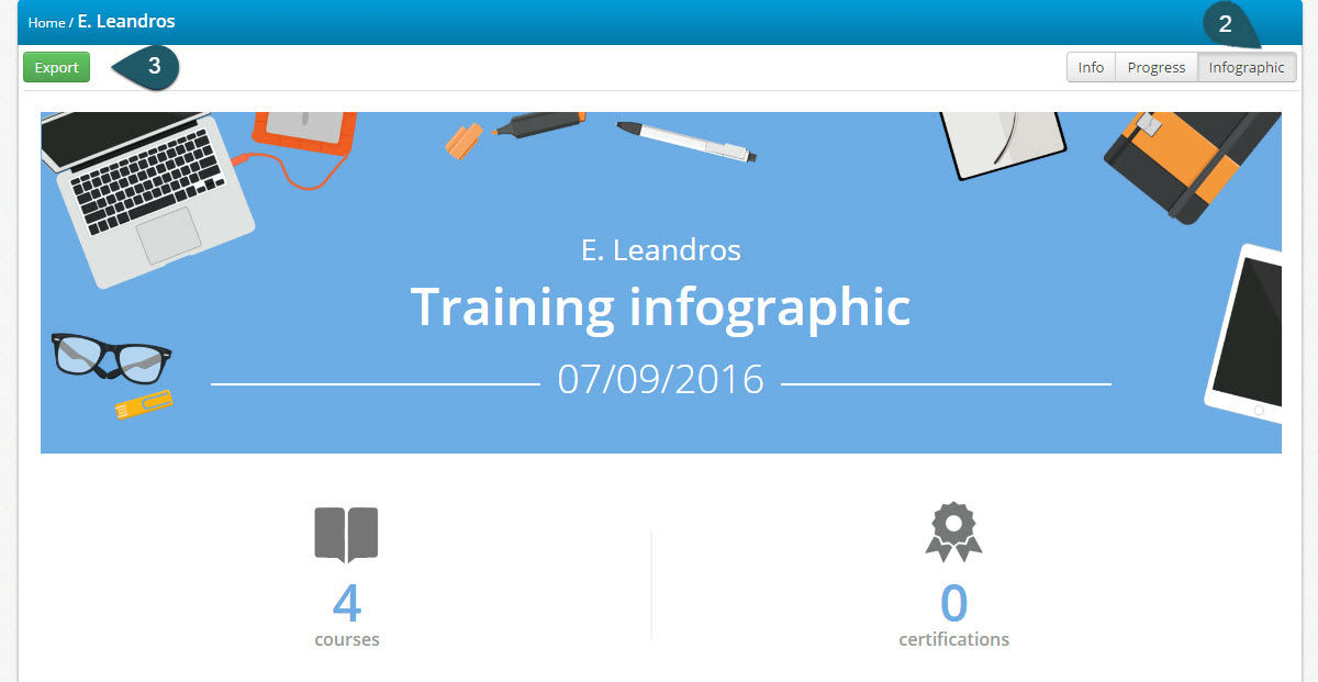
Our more recent infographic addition gives you the ability to view and export a training infographic for any individual user.
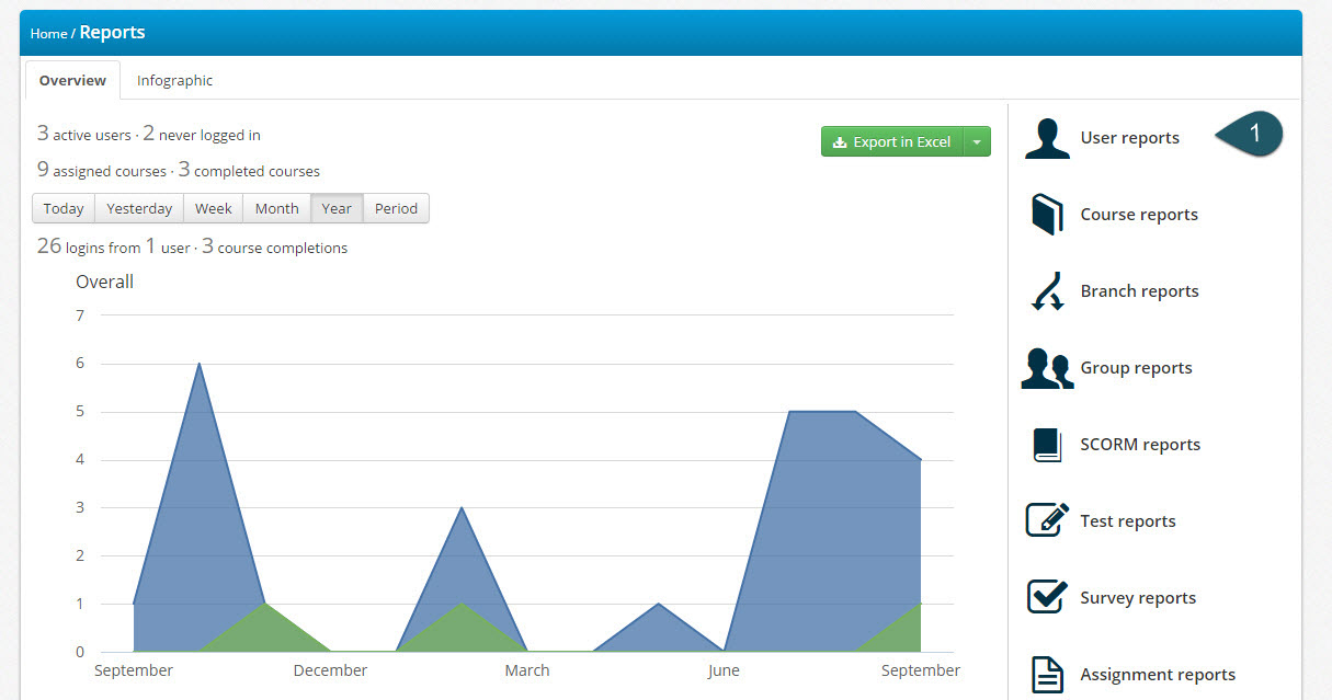
You can easily access this eLearning infographic by entering the User reports, and, after selecting a user, clicking on the “Infographic” tab on the right side of the screen. Alternatively, you can also access the Infographic from the User’s profile page. Finally, learners can directly view their own training infographic report by clicking on the Progress link on their sidebar.
The infographic displays general statistics on the user’s portal usage, their total training time, a graph of their most active courses, and their course completion and test pass rates.
Like with the Portal infographic, here too you’ll find the “Export” button on the top of the screen, which allows you to export your infographic as a PNG file for sharing.
Conclusion
In this post, we had a look at TalentLMS’ built-in eLearning infographic creation capabilities, and examined the two ready-made templates on offer, for seeing statistics on your overall training portal and for individual users.
Have you made use of the training infographic feature in TalentLMS? What other Infographics would you like to see added to the platform or what other information you’d find useful in the existing infographics? Let us know; after all, these are for you to enjoy!